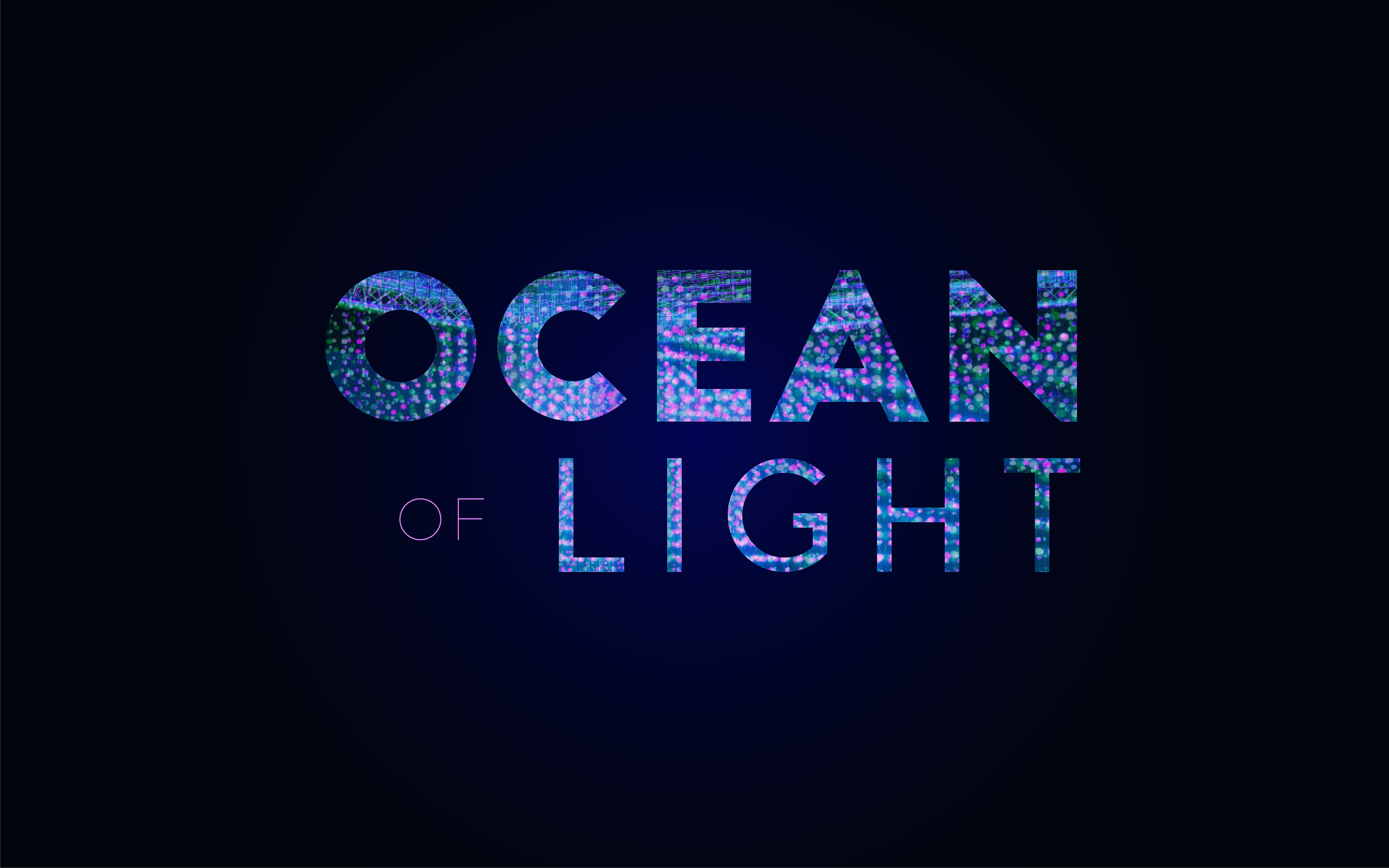
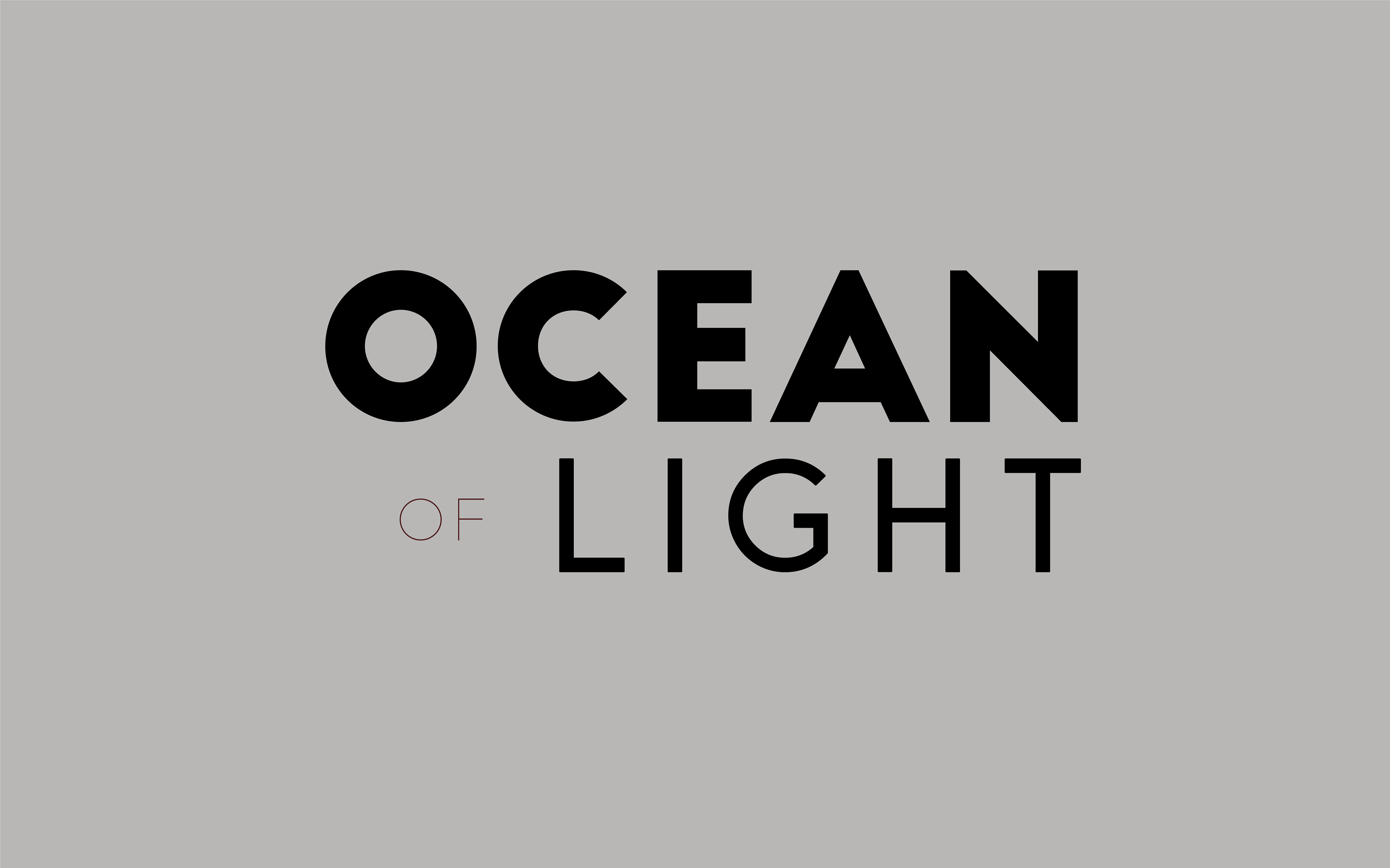
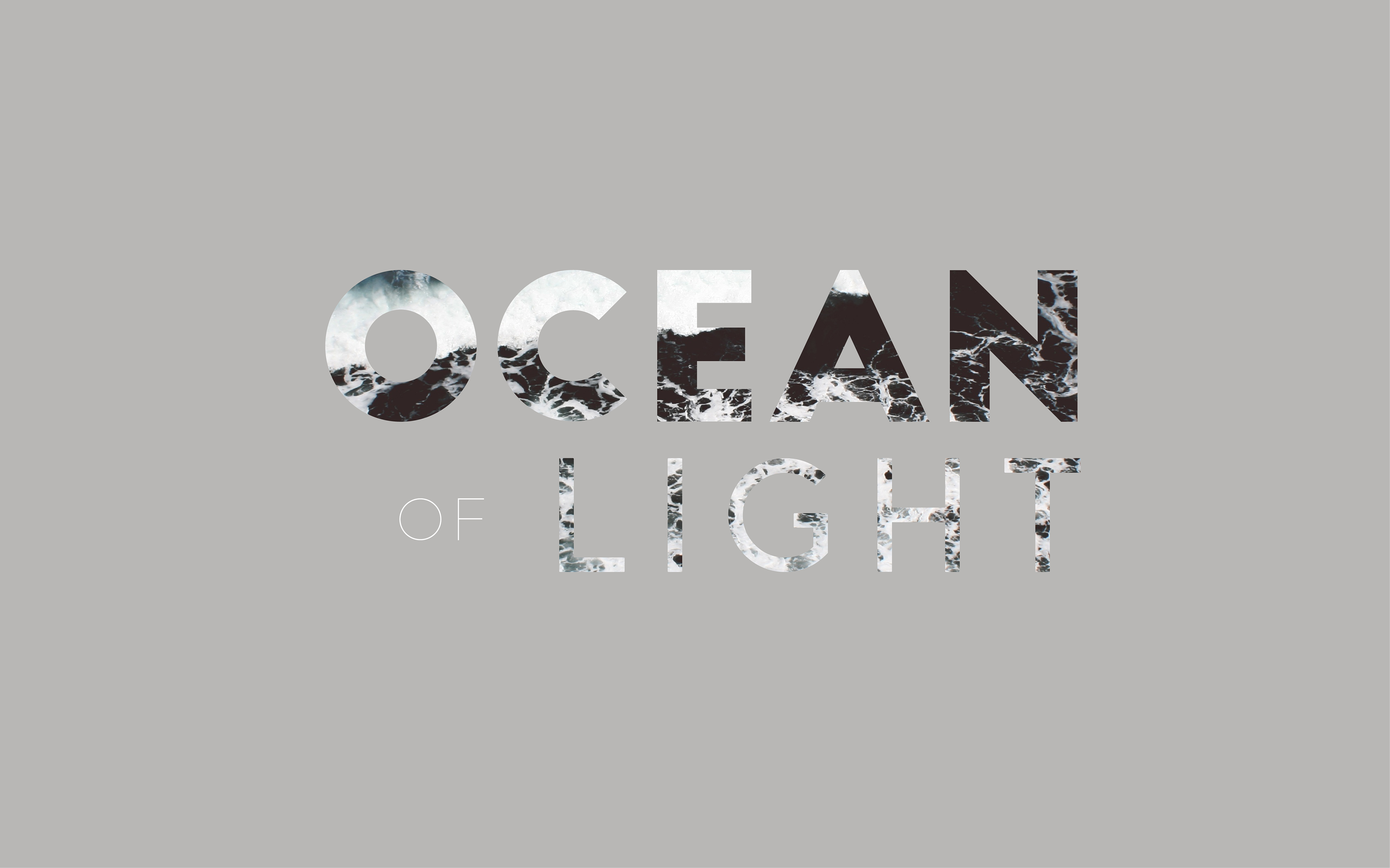
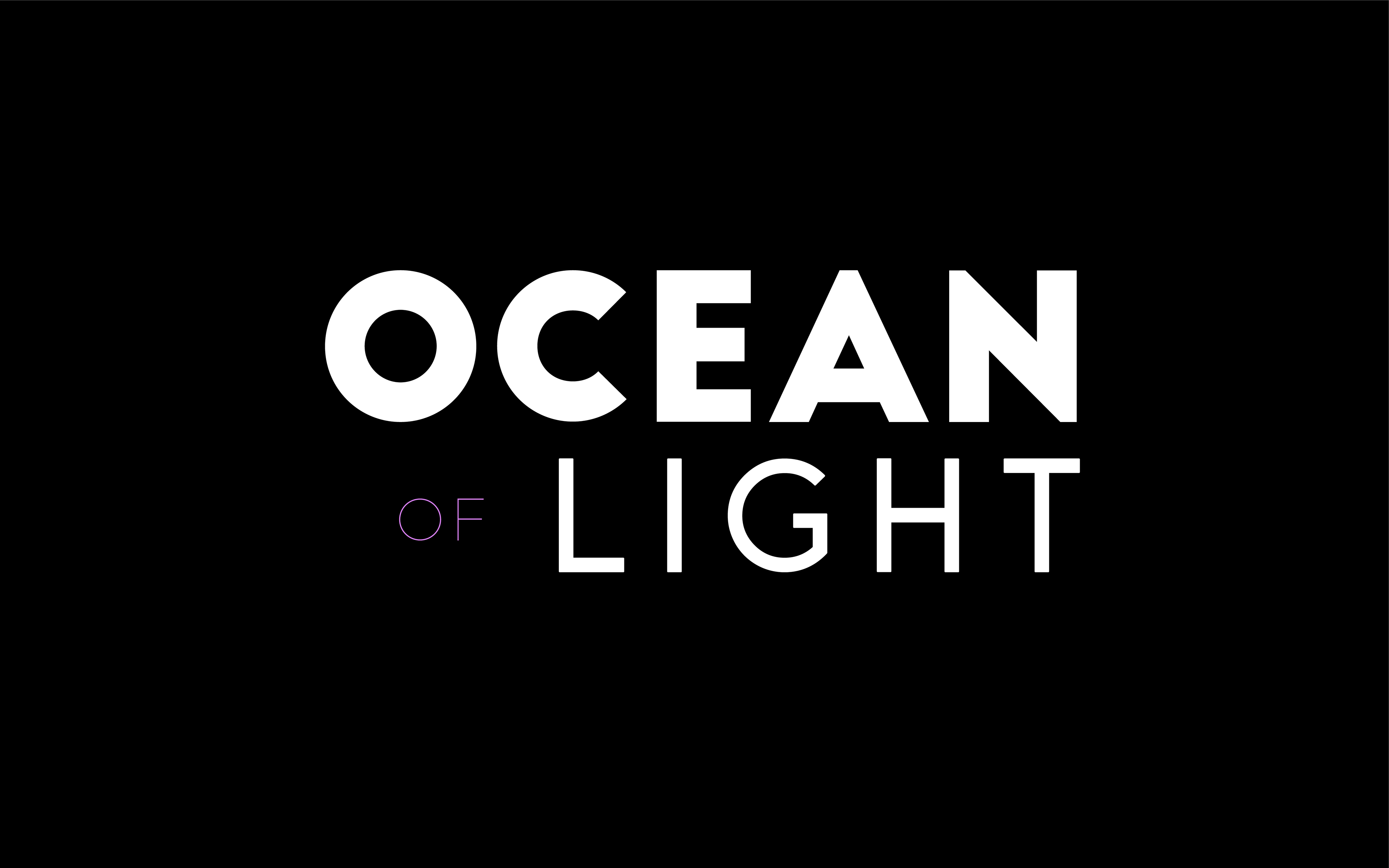
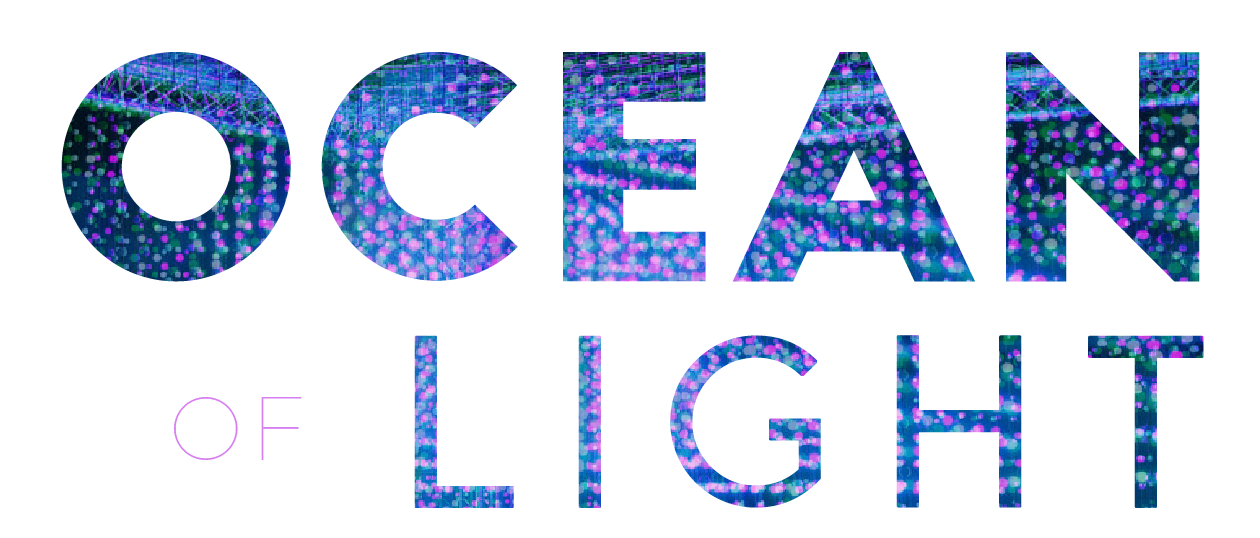
Ocean of Light is a lighting software owned by Squidsoup. During a university project, we had to create a design for the lighting software. Here are some of my design concepts for the Main logo and a sub logo for the software.
With the designs I chose a strong and bold font as it gave the brand gave a strong and slick feel. The smoothness in the curves representing the smooth touch of the bulbs in the lights and the sharp edges for a sharp contrast in reference of the lights being a powerful tool.
The colours used are taken from the photos that already exists and tried to find an ocean gradient to replicate the ocean feel. The grey design you see under has a masked ocean wave and fitted well with the minimal grey.
The colours used are taken from the photos that already exists and tried to find an ocean gradient to replicate the ocean feel. The grey design you see under has a masked ocean wave and fitted well with the minimal grey.
Please have a look below.